Every map you’ve ever seen is wrong. It has to be: you can’t flatten a sphere without distorting something. The question is what you choose to distort, and what that choice reveals about who made the map and why.
The orange peel problem
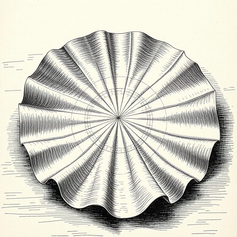
Here’s a party trick for your next dinner: take an orange, peel it carefully, and try pressing the skin flat on a table. It rips. It buckles. It won’t lie flat without tearing or stretching, because the surface of a sphere has intrinsic curvature that a flat surface doesn’t. Carl Friedrich Gauss proved this mathematically in 1827 with his Theorema Egregium (“remarkable theorem”): you cannot map a curved surface onto a flat one without distorting something. Not “it’s hard.” It’s mathematically impossible.
This wasn’t just a theoretical curiosity. Gauss was working for the Kingdom of Hanover at the time, conducting a geodetic survey, and the problem was very practical: how do you accurately represent the curved surface of northern Germany on flat paper? His answer (you can’t, not perfectly) has haunted cartographers ever since.
You can see the problem on a globe, too. Find one with longitudinal lines drawn on it and look closely at the segments between them. Near the equator, those segments are wide, roughly rectangular strips. Near the poles, they’re thin, tapered wedges. If you tried to peel those strips off and lay them flat, you’d get a row of shapes with gaps between them: the gore pattern, which is how many globe manufacturers print their paper covers. Those gaps are the distortion that Gauss proved you can’t eliminate.
So every flat map is a compromise. The cartographer picks which properties to preserve and which to sacrifice. The four things that can distort are area (how big things look), shape (how round or stretched things look), distance (how far apart things are), and direction (which way things point relative to each other). No flat map can preserve all four. You pick your poison.
A projection that preserves shape locally is called conformal. A projection that preserves area is called equal-area (or equivalent). A projection that preserves distance from a single point is called equidistant. No projection can be both conformal and equal-area; the mathematics forbids it. This is one of those constraints that feels like it should have a workaround, some clever trick that satisfies both requirements. There isn’t one. Gauss proved it, and that’s the end of the discussion.
The formal name for the mathematical function that converts points on a sphere to points on a flat surface is a map projection, and there are hundreds of them. Each one is a different set of trade-offs, a different answer to the question “what are you willing to get wrong?”
Mercator: the map that ate the world
The projection most people have stuck in their heads (the one on classroom walls, Google Maps’ default, the mental image of what the world “looks like”) is the Mercator projection, created by Gerardus Mercator in 1569.
Mercator was a Flemish cartographer who’d already been imprisoned for heresy (he was a Protestant in Catholic Flanders, not a healthy combination in the 1540s) and had spent decades making globes and maps by the time he published his world chart in 1569.
The projection was designed for a specific, practical purpose: sailors. Its defining trick: it preserves direction. If you draw a straight line between two points on a Mercator map and measure the angle it makes with the vertical, that’s the constant compass bearing you need to sail between them. Navigators call this a rhumb line or loxodrome, and for the Age of Exploration, it was revolutionary. You could plot a course with a ruler and a protractor, hand the bearing to your helmsman, and actually arrive where you intended.
Mathematically, the Mercator projection works by stretching the east-west scale at higher latitudes to keep shapes locally correct (a property called conformality). But to maintain conformality, it must also stretch the north-south scale by exactly the same factor. At 60 degrees latitude, that scale factor is 2. At 80 degrees, it’s nearly 6. At the poles, it’s infinite: the Mercator projection literally cannot represent the poles, which is why Mercator maps always cut off somewhere around 85 degrees north and south.
The cost of preserving direction is grotesque distortion of area, especially near the poles. The further from the equator you get, the more the map stretches things out. It’s not subtle. On a Mercator map:
- Greenland looks roughly the size of Africa. In reality, Africa is about 14 times larger (30.37 million km^2 vs 2.17 million km^2).
- Alaska looks bigger than Mexico. Mexico is actually larger.
- Antarctica stretches across the entire bottom of the map like a frozen continent the size of Asia. It’s big, but not that big.
- Europe looks enormous relative to South America. Brazil alone is larger than the contiguous United States, which most people find genuinely surprising.
The Mercator projection inflates everything near the poles and shrinks everything near the equator. The countries that benefit from this distortion (the ones that look larger and more important than they are) tend to be wealthy nations in the northern hemisphere. The countries that get shrunk are predominantly in Africa, South America, and South-East Asia. Nobody designed it that way on purpose (Mercator was trying to help sailors, not flatter Europeans), but the political effect is real and has been debated for decades.
If you want to viscerally feel the distortion, visit thetruesize.com, a web tool that lets you drag country outlines to different latitudes and watch them shrink and grow in real time on a Mercator map. Drag Greenland from its polar position down to the equator and it shrinks to a sliver. Drag the Democratic Republic of Congo (which is roughly the size of Western Europe) up to Greenland’s latitude and it bloats to fill the Arctic. It’s the same land area, the same number of square kilometres. The projection is doing all the work.
XKCD #977, “Map Projections”, captures this brilliantly. “What your favourite map projection says about you” is a comic that pairs each projection with a personality type. Mercator? “You’re not really into maps.” It’s funny because it’s accurate: if the Mercator is the only projection you know, you probably haven’t thought about what it’s doing to your sense of the world.
The alternatives
Once you realise Mercator is lying to you about area, the natural question is: can we fix that?
The Gall-Peters projection (proposed by James Gall in 1855, a Scottish clergyman with an interest in cartography, and independently promoted over a century later by Arno Peters, a German historian, in 1973) preserves area perfectly. Every country is the correct size relative to every other country. Africa looks enormous because it is enormous. The trade-off: shapes get mangled. Countries near the equator are stretched vertically, and countries at high latitudes are squashed horizontally. Greenland looks like a melted pancake. Shapes are technically “wrong,” but Peters argued that correctly representing the relative size of nations matters more than making them look pretty, especially when the distortion of Mercator systematically inflates the former colonial powers.
The Peters projection became a genuine cultural battleground in the 1970s and 80s. It was adopted by the United Nations, Oxfam, UNESCO, and various aid organisations as a deliberate statement about global equity. The West Wing television series devoted an entire scene to it: a group of cartographers petition the White House to mandate the Peters projection in schools, arguing that the Mercator map perpetuates a colonialist worldview. It’s a brilliant bit of television, and the politics it dramatises are real.
The counter-argument from professional cartographers was that Peters sacrificed too much. Shapes are so distorted that the map is hard to use for anything practical. And there was irritation that Peters promoted his projection as revolutionary when Gall had published the same maths over a century earlier. The whole affair is a case study in how a technical choice (which projection to use) becomes a political argument (whose interests does this map serve?), which is really the theme of this entire post.
The Robinson projection (1963) is sometimes called the diplomats’ choice: a compromise that preserves nothing perfectly but distorts everything only a little. Arthur Robinson designed it for Rand McNally, and the National Geographic Society used it from 1988 to 1998. It looks “right” to most people: shapes are recognisable, areas are roughly proportional, and no single region is grotesquely distorted. It achieves this by being, in technical terms, neither conformal (shape-preserving) nor equal-area, but a subjective best-of-neither that just looks balanced.
The Winkel Tripel replaced Robinson as the National Geographic Society’s standard in 1998 and remains their default. It minimises the combined distortion of area, distance, and direction: the word “Tripel” literally means “triple” in German, referring to those three properties. It’s mathematically elegant and aesthetically pleasing, which is a rare combination. It was created by Oswald Winkel in 1921 and languished in relative obscurity for decades before National Geographic adopted it. Most people have seen it without knowing its name; it’s the slightly oval projection that looks like a rounded rectangle, with curved meridians and an equator that isn’t quite as long as the projection is wide.
And then there’s the one that looks like someone dropped the Earth and it broke.
Buckminster Fuller’s Dymaxion map (1943, refined in 1954) unfolds the globe onto an icosahedron (a twenty-faced polyhedron) then lays the faces flat. The result shows all the continents as a nearly contiguous landmass, with minimal distortion of either area or shape. It looks bizarre. It’s hard to orient yourself. There’s no “up.” And that’s partly the point: Fuller wanted to break people’s habit of thinking of the world with a fixed orientation, with north at the top and the wealthy nations front and centre. It’s a provocation as much as a projection.
More recently, the AuthaGraph projection by Hajime Narukawa (2016) unfolds the globe onto a tetrahedron and then tiles it into a rectangle, achieving remarkably even distortion of area and shape across the entire map. It won a Japanese Good Design Award and has been adopted in Japanese school textbooks. It’s one of the few projections that can show the world as a seamless, repeating tile (tesselating into an infinite plane) which makes it useful for showing global patterns that wrap around the date line.
There are hundreds more. The azimuthal equidistant (used by the UN logo; all distances from the centre point are correct). The Mollweide (equal-area, elliptical, popular for global distribution maps). The stereographic (preserves shape locally, used for polar maps). The transverse Mercator (rotated 90 degrees, used for local-area mapping including most national grid systems). Each one is an answer to a specific question about what matters most.
The sheer number of projections isn’t a failure of cartography; it’s a reflection of the fact that different questions need different maps. A sailor navigating the Atlantic needs Mercator. A climate scientist mapping rainfall needs an equal-area projection. A pilot planning a polar route needs an azimuthal projection centred on the pole. An urban planner mapping a single city needs a local projection that minimises distortion over a small area (this is what the Universal Transverse Mercator, or UTM, grid provides; it divides the world into sixty narrow north-south strips, and within each strip, distortion is tiny). The “best” projection depends entirely on what you’re trying to do, and anyone who tells you there’s one correct map of the world is either selling you something or hasn’t thought about it hard enough.
There’s actually a delightful classification system for projections based on the surface you project onto. Cylindrical projections (including Mercator) wrap a cylinder around the globe. Conic projections place a cone over the globe, touching it along one or two lines of latitude; these work well for mid-latitude regions like Australia or the contiguous United States, which is why you’ll often see conic projections in national atlases. Azimuthal (or planar) projections project onto a flat surface touching the globe at a single point, and they’re the natural choice for polar regions. And then there are the projections that don’t fit neatly into any category: the pseudocylindrical, polyconic, and compromise projections that cartographers have invented over the centuries to solve specific problems. The taxonomy of projections is itself a map of human ingenuity in the face of an unsolvable problem.
The lumpy Earth
Here’s where it gets properly weird. The Earth isn’t a sphere. It’s not even a nice, neat ellipsoid; it’s an oblate spheroid, fatter at the equator than at the poles by about 21 kilometres, because the planet’s rotation flings mass outward. The equatorial bulge is real and significant: stand at sea level on the equator and you’re about 21 km further from the Earth’s centre than someone standing at the North Pole. Everest’s summit is the highest point above sea level, but the point on the Earth’s surface furthest from the centre is actually the summit of Chimborazo in Ecuador, because it sits on the equatorial bulge. Maps don’t usually mention this.
But even the ellipsoid isn’t quite right. The actual shape of the Earth (the shape you’d get if you covered the whole thing in a still ocean at a uniform height) is called the geoid, and the geoid is lumpy. Gravitational anomalies caused by variations in rock density, mantle convection, and the remnants of ancient geological processes create hills and valleys in the geoid that can differ from a perfect ellipsoid by up to 100 metres. The geoid dips by about 106 metres south of India (an enormous gravitational “hole” likely caused by mantle dynamics), and it rises by about 85 metres near Iceland. If you’ve seen those exaggerated models of the geoid that look like a misshapen potato (sometimes called the “Potsdam potato” after the GFZ research centre that produced the visualisation) that’s what’s going on.
Why does any of this matter in practice? Because height is measured relative to the geoid, not the ellipsoid. When your GPS says you’re at 50 metres elevation, it means 50 metres above the WGS84 ellipsoid. But the “height above sea level” on a topographic map means height above the geoid, which can differ from the ellipsoid by tens of metres depending on where you are. Converting between the two requires a geoid model, which is yet another layer of mathematical approximation sitting between your coordinates and the physical world.
This matters because your GPS coordinates aren’t measured against the actual, physical surface of the Earth. They’re measured against a datum: a mathematical model of the Earth’s shape. The current global standard is WGS84 (World Geodetic System 1984), the reference frame used by GPS. When your phone says you’re at -31.9505, 115.8605 (that’s Perth), those numbers describe a point on the WGS84 ellipsoid, which is close to but not identical to the actual surface underneath you. The difference is usually small (a metre or two) but if you’re doing survey work, building a bridge, or aligning a tunnel from both ends, “a metre or two” is a career-ending error.
Different countries use different datums, which creates its own confusion. The Ordnance Survey in the UK uses OSGB36, tied to the Airy 1830 ellipsoid. European surveys used ED50 for decades before switching to ETRS89. India uses its own Everest ellipsoid, defined in 1830. If you take coordinates from one datum and plot them on a map using a different datum, you can be off by hundreds of metres. The numbers look the same (latitude and longitude) but they mean subtly different things because they’re measured against different models of the Earth’s shape.
And here’s the thing about Australia specifically. The Australian tectonic plate is moving northward at about 7 centimetres per year. That sounds trivial until you multiply it by decades. Australia’s previous datum, GDA94 (Geocentric Datum of Australia 1994), was aligned with WGS84 as of 1994. By 2020, the continent had drifted about 1.8 metres north of where GDA94 said it was. That’s enough to put your GPS coordinates on the wrong side of a road. So in 2020, Australia adopted GDA2020, which corrected for that drift. Your coordinates shifted by 1.8 metres overnight, not because you moved, but because the datum did. If someone gives you Australian coordinates and doesn’t tell you which datum they’re in, you could be nearly two metres off. For a bushwalk, fine. For a self-driving car, catastrophic.
There’s an even more elegant solution in the works. GDA2020 is a static datum: a snapshot of where the plate was at the start of 2020. Geoscience Australia has also defined a dynamic datum called ATRF2014 (Australian Terrestrial Reference Frame 2014) that tracks the plate’s movement continuously, updating coordinates in real time relative to the global frame. In principle, a dynamic datum never goes stale. In practice, most software and most people can’t handle coordinates that change slightly every year, so GDA2020 remains the standard for everyday use. But the surveyors know the continent is still drifting, and the maths is keeping up.
Tiling the world
When you open Google Maps or OpenStreetMap and drag your way around the planet, you’re not looking at one enormous image. You’re looking at tiles: small square images, usually 256 by 256 pixels, that the server has pre-rendered and cached at every zoom level.
The system is elegant. At zoom level 0, the entire world fits in a single tile. At zoom level 1, the world is divided into 4 tiles (a 2x2 grid). At zoom level 2, it’s 16 tiles (4x4). Each zoom level doubles the number of tiles in each dimension, so the total number of tiles at zoom level z is 4^z. By zoom level 18 (the level where you can see individual buildings) there are roughly 69 billion tiles. By zoom level 20, over a trillion.
This is called a slippy map, and it’s the architecture behind virtually every interactive web map. Your browser requests only the tiles it needs for the current view, which means you’re downloading a few kilobytes of image data instead of a multi-terabyte planet. As you pan, new tiles load at the edges. As you zoom in, higher-resolution tiles replace the coarser ones.
The tiles can be raster (pre-rendered images, like photographs) or vector (data describing the geometry of roads, buildings, and labels, rendered by your browser in real time). Raster tiles are simpler and faster to display, but they’re fixed in style and resolution. Vector tiles are smaller, sharper at any zoom, and can be styled dynamically, which is why Mapbox and modern Google Maps can switch between light mode, dark mode, and satellite view without re-downloading the whole map. The browser has the geometry; it just repaints it with different colours.
The server-side infrastructure for generating and serving these tiles is a whole world in itself. OpenStreetMap uses a rendering stack that takes the raw geographic data (stored in PostgreSQL with PostGIS), applies style rules (written in a language called CartoCSS or Mapbox GL style JSON), renders each tile as an image (using a renderer called Mapnik), and caches the result. The main OpenStreetMap tile servers render and serve millions of tiles per day, powered entirely by donations and volunteers.
There’s a clever trick to the tile numbering. Each tile is identified by three numbers: zoom level, x coordinate, and y coordinate. The URL for a tile follows a predictable pattern, something like https://tile.openstreetmap.org/{z}/{x}/{y}.png. This means any client can calculate which tiles it needs for a given viewport and zoom level, request them in parallel, and assemble them locally. No conversation with the server about “what should I show?” is required. The client already knows. This stateless, predictable addressing scheme is what makes slippy maps feel so responsive: by the time you’re dragging the map, your browser is already requesting the tiles it’s about to need.
The projection used for web map tiles is a variant of Mercator called Web Mercator (EPSG:3857, if you want the code). It’s slightly different from the true Mercator that Gerardus would have recognised: it treats the Earth as a perfect sphere rather than an ellipsoid, which introduces a small error but makes the tile maths much simpler. This is the projection that covers the whole world in a single square at zoom level 0, making it easy to divide recursively into four. The geographic community has strong opinions about Web Mercator’s inaccuracies, but the web won; it’s the de facto standard for interactive maps, and fighting it is like arguing against QWERTY keyboards.
Finding things nearby
“Find all restaurants within 5 kilometres” sounds like a simple query. It isn’t. And the reason it isn’t tells you something interesting about the difference between human intuition and computational geometry.
When you look at a map and eyeball which restaurants are “nearby,” your brain does something extraordinary: it processes spatial relationships in parallel, instantly discarding obviously distant candidates and focusing on a small cluster. Computers don’t get to do this. They have a list of coordinates and no spatial intuition.
The naive approach (calculate the distance from your location to every restaurant in the database, then filter for the ones within 5 km) is absurdly expensive. If your database has a million restaurants, that’s a million distance calculations, each involving trigonometry. For a single query, that’s slow. For a service handling thousands of queries per second, it’s impossible.
The trick is to approximate first, then refine. Start with a bounding box: a rectangle defined by minimum and maximum latitude and longitude that encloses the 5 km radius circle around your position. Bounding box calculations are fast: just compare coordinates with simple arithmetic. Filter out everything outside the box (this eliminates the vast majority of candidates with almost no computation), and only then calculate the actual distance to the remaining points.
That actual distance, on a sphere, requires the Haversine formula: a trigonometric calculation that accounts for the Earth’s curvature. It’s more expensive than a simple Pythagorean calculation (which would work fine on a flat surface), but it gives you the great circle distance: the shortest path between two points on the surface of a sphere. For short distances (a few kilometres), the error from using a flat-Earth approximation is small, but for anything over a few dozen kilometres, the Haversine formula or its more precise cousin, the Vincenty formula, is necessary.
Making this fast in a database requires a spatial index. The two most common types are R-trees (which group nearby objects into nested bounding rectangles, creating a hierarchy that can be searched efficiently) and quad-trees (which recursively divide space into four quadrants, like the tiling system for web maps but applied to database indexing).
An R-tree works by grouping nearby objects into bounding rectangles, then grouping those rectangles into larger rectangles, building up a hierarchy. To find all objects near a point, the database walks the tree from the top, discarding entire branches whose bounding rectangles don’t overlap the search area. Instead of checking a million objects, it might check a few hundred nodes in the tree and then a few dozen actual objects. The algorithmic complexity drops from O(n) to roughly O(log n), which is the difference between a query that takes seconds and one that takes milliseconds.
PostGIS, the spatial extension for PostgreSQL, uses a generalised search tree (GiST) index that behaves like an R-tree. When you write SELECT * FROM restaurants WHERE ST_DWithin(location, my_point, 5000), PostGIS uses the spatial index to find candidates in the bounding box, then applies the precise distance calculation only to those candidates. The result is a query that runs in milliseconds even on a table with millions of rows.
PostGIS also gives you a rich vocabulary of spatial operations beyond simple proximity. ST_Contains tests whether one geometry contains another. ST_Intersects tests whether two geometries overlap. ST_Buffer creates a zone around a geometry. ST_Union merges geometries. You can ask questions like “which council areas does this proposed pipeline cross?” or “what’s the total area of parkland within 2 km of this school?” in a single SQL query. It’s geographic reasoning expressed as database operations, and once you’ve seen it work, you start seeing spatial questions everywhere.
This is, incidentally, how every ride-hailing app, food delivery service, and “things near me” feature works. Bounding box first (cheap), precise distance second (expensive but only on a small set), spatial index underneath to make the first step fast.
There’s a subtlety to bounding boxes that’s easy to miss. Near the equator, one degree of longitude is about 111 kilometres, roughly the same as one degree of latitude. But as you move toward the poles, lines of longitude converge. At Perth’s latitude (about 32 degrees south), one degree of longitude is only about 94 kilometres. At 60 degrees, it’s about 55 kilometres. At the poles, it’s zero. So a bounding box that’s “5 km in each direction” requires a different longitude range depending on your latitude. Get this wrong and your bounding box is either too large (wasteful but correct) or too small (efficient but missing results). Most spatial libraries handle this automatically, but it’s the kind of detail that bites you if you’re rolling your own implementation.
Great circles and why planes fly funny
Pull up a Mercator map and draw a straight line from Sydney to London. It goes roughly west across the Indian Ocean, up through the Middle East, and across Europe. And indeed, the classic Sydney-to-London route goes via Singapore or Dubai, more or less along that line.
But a straight line on a Mercator map is not the shortest path between two points on a globe. The shortest path is a great circle: the curve you get when you slice the globe with a plane that passes through the centre of the Earth. On a Mercator map, great circles appear as curved arcs, not straight lines. This is a direct consequence of Mercator’s preservation of direction: if your straight lines maintain constant compass bearing, they can’t also be shortest-distance paths. You can have one or the other. Mercator chose direction.
The mathematical proof is elegant. A rhumb line (constant compass bearing) spirals toward the pole in a curve called a loxodrome. A great circle follows the actual curvature of the Earth. On short distances, the difference is negligible. On intercontinental distances, it’s massive: the great circle between two points can be hundreds of kilometres shorter than the rhumb line.
The great circle from Sydney to London actually arcs far north: over Indonesia, across Central Asia, and down through Eastern Europe. It’s significantly shorter than the Mercator “straight line.” Flights don’t always follow the great circle exactly (they’re constrained by jet streams, airspace politics, and the need to be within a certain range of emergency landing strips; regulations require twin-engine aircraft to be within a certain number of minutes’ flying time from a suitable diversion airport, which is why ETOPS certification matters for long over-water routes), but the route is driven by the geometry. That’s why flights from Australia to Europe often route through the Middle East or across the pole rather than in a straight line across the map.
The same principle is why a flight from New York to Tokyo goes over Alaska rather than across the Pacific in a straight line. On a globe, the great circle between those cities passes over the Arctic. On a Mercator map, that looks insane: it looks like you’re going massively out of your way. You’re not. You’re going the shortest way. The map is lying.
The Haversine formula, which calculates great circle distance, has been known since the 19th century but gets its name from the haversine function: half the versed sine, a trigonometric function that was once common in navigation tables because it avoids the numerical instability that plagued other distance formulas when dealing with very short or antipodal distances. For most programming purposes, you’d use it like this: take the latitude and longitude of two points in decimal degrees, convert to radians, apply the formula, and multiply by the Earth’s mean radius (about 6,371 km). The result is accurate to within about 0.3% (because the Earth isn’t a perfect sphere). For higher accuracy, the Vincenty formula models the Earth as an oblate spheroid and iterates to a solution, but it’s slower and the difference rarely matters unless you’re doing geodetic survey work.
The Haversine formula is one of those pieces of maths that virtually every developer encounters at some point. It turns up in interview questions, in Stack Overflow answers, and in the guts of location-based services. It’s been reimplemented in every programming language that has ever existed. And most people who use it don’t know why it’s called “haversine”; the name comes from an era when trigonometric lookup tables were printed in books and the choice of function mattered for the accuracy of hand calculation. The haversine avoided the subtraction of nearly-equal numbers (which loses precision in limited-decimal arithmetic), making it the navigator’s friend in the age of pencil and paper.
One more quirk about great circles: they mess with your intuition about distance in a way that has real, practical consequences. And this isn’t just an academic point. The great circle distance from Perth to London is about 14,500 kilometres. The great circle distance from Perth to Johannesburg is about 9,200 kilometres. But on a Mercator map, London looks closer because it’s in a more familiar part of the map and because Mercator compresses the distances near the equator where the Perth-to-Johannesburg route runs. Your gut feeling about “how far away” places are is almost certainly calibrated to a Mercator projection, and that calibration is wrong.
The Wikipedia of maps
OpenStreetMap (OSM) is to maps what Wikipedia is to encyclopaedias: a collaborative, volunteer-built, open-data project that has become quietly indispensable.
Founded in 2004 by Steve Coast, a British entrepreneur frustrated by the Ordnance Survey’s restrictive licensing of UK map data (publicly funded data that the public couldn’t freely use), OSM started with a radical premise: if the official maps aren’t open, we’ll make our own. Coast and early contributors walked around London with GPS receivers, logged their tracks, and traced them into a database. It was painstaking, often one street at a time.
Twenty years later, OSM has over 10 million registered contributors and data covering virtually every road on Earth. In many cities, it’s the most detailed map available: more detailed than Google, more detailed than any government mapping agency. The data is licensed under the Open Database Licence (ODbL), which means anyone can use it, modify it, and build on it, as long as they attribute OSM and share any improvements back.
OSM powers a staggering range of services. Facebook uses it for its background maps. Apple Maps draws significantly on OSM data. Microsoft uses it. Snap uses it. Virtually every mapping application that isn’t Google Maps is using OSM data somewhere in its stack, often without most users realising it.
Humanitarian organisations use it for disaster response, and this might be OpenStreetMap’s most important contribution. The Humanitarian OpenStreetMap Team (HOT) organises remote mapping of disaster-affected areas, where volunteers around the world trace buildings and roads from satellite imagery to help first responders on the ground. The model works like this: a disaster strikes in an area with poor existing map coverage. HOT activates a mapping task, dividing the affected area into small squares. Volunteers claim a square, open satellite imagery in their browser, and trace every visible building, road, and waterway. Their edits go into the OSM database and are available to aid workers within hours.
When Cyclone Idai hit Mozambique in 2019, thousands of remote mappers traced tens of thousands of buildings in the affected area within days, producing maps that didn’t exist before the disaster and that aid workers relied on for navigation and logistics. The 2010 Haiti earthquake was the event that catalysed this movement: in the days after the earthquake, the OSM community mapped Port-au-Prince from satellite imagery more thoroughly than it had ever been mapped before, and the resulting data was used by the Red Cross, the UN, and dozens of other organisations on the ground. Crisis mapping is now a recognised discipline, and OSM is its primary platform.
The data model is beautifully simple. Everything in OSM is either a node (a point: a tree, a postbox, a traffic light), a way (a line or polygon: a road, a river, a building outline), or a relation (a group of nodes and ways that form a complex feature: a bus route, a national boundary). Each feature is described by tags: key-value pairs like highway=residential, name=King Street, or cuisine=thai. There’s no fixed schema. If you need a tag that doesn’t exist, you invent one and document it on the wiki. It’s chaotic and it works.
The quality varies, as you’d expect. In well-mapped cities like Berlin, London, or Tokyo, OSM data rivals or exceeds commercial alternatives: every building, every bench, every fire hydrant. In rural areas of developing countries, coverage can be sparse. But this is where the humanitarian mapping comes in, and where the open-data model shines: when a disaster hits, the map can be updated in hours by thousands of volunteers, without waiting for a commercial company to decide the area is profitable enough to map.
There’s a lovely detail about how OSM editing works. When you edit a road, you’re not drawing on a canvas; you’re placing nodes (points with latitude-longitude coordinates) and connecting them with ways. A curvy road is just a sequence of closely-spaced nodes. A straight road is two nodes connected by a way. A roundabout is a closed way. Your edit goes into a global database, and the next time someone requests a tile covering that area, the rendering stack picks up your change and redraws it.
There’s no approval process for most edits; they go live immediately. This sounds like a recipe for disaster, and occasionally it is. Vandalism happens (someone once turned a lake into a certain anatomical shape, as you’d expect from the internet). But the community has developed robust tools for catching bad edits: automated quality assurance checks, watchlists on sensitive areas, and a revert system that can undo changes quickly. The social norms are strong. Most edits are made in good faith by people who care deeply about mapping their local area accurately. It’s one of the largest collaborative information projects on the planet, and it works for the same reason Wikipedia works: because enough people care enough to maintain it.
The politics of borders
Here’s where maps get genuinely uncomfortable.
Borders are political claims, and a map that shows a border is making a political statement. This gets complicated fast when different countries disagree about where a border is, or whether a border exists at all. There are roughly 150 active territorial disputes on Earth at any given time, and every one of them requires the mapmaker to take a side, or to find some visual convention for ambiguity, like a dashed line, which is itself a statement.
Google Maps shows different borders depending on which country you’re viewing from. In India, Kashmir is shown as entirely Indian territory, because Indian law requires it. In Pakistan, the line of control is shown as disputed. In China, Arunachal Pradesh (which China claims as part of Tibet) is labelled differently. If you’re viewing from a third country, Google shows a compromise: dotted lines indicating disputed territory.
Crimea appears as Russian territory on Google Maps viewed from Russia, and as Ukrainian territory (occupied) from Ukraine and most of the West. Taiwan is shown as a separate country on maps viewed from countries that recognise it, but as a Chinese province on maps viewed from China. The Western Sahara appears as part of Morocco or as a separate disputed territory depending on your location.
The technical implementation of this is fascinating. Google maintains separate versions of its map data for different legal jurisdictions. When you load Google Maps, your request is geolocated (using your IP address), and the appropriate version of the border data is served. The underlying geographic data is the same: the same satellite imagery, the same road network, the same building outlines. Only the political overlay changes. This means Google is maintaining multiple parallel realities, each one legally correct in its jurisdiction and potentially illegal in another.
Apple, Bing, and other mapping services face the same problem and solve it similarly. India’s Survey of India Act and IT Act require that any map shown to users in India must depict the entire territory of Jammu and Kashmir as Indian. China’s “Map Management Regulations” require that maps shown in China include the “nine-dash line” in the South China Sea. Russia requires that Crimea be shown as Russian. Fail to comply and you risk being blocked, fined, or prosecuted. The map is not the territory, but the law treats it as if it were.
These aren’t bugs. They’re deliberate editorial decisions, and they have legal consequences: companies can face fines or market bans for showing the “wrong” borders.
Place names are just as political. Is it the Persian Gulf or the Arabian Gulf? The Sea of Japan or the East Sea? Mumbai or Bombay? Kolkata or Calcutta? Uluru or Ayers Rock? (In Australia, dual naming has become the standard for many features, with the Indigenous name typically listed first.) Every name on a map is a choice, and every choice has a history. The exonym (a name used by outsiders, “Germany” for Deutschland, “Japan” for Nihon) is often the colonial name, and the shift toward using endonyms (the name a place calls itself) is a political act as much as a cartographic one.
A map is never neutral. Every border it draws, every name it uses, every territory it colours is a statement about who controls what. Cartographers have understood this for centuries: maps don’t just describe power, they project it. The British Ordnance Survey was founded in 1791 to map the Scottish Highlands, not for geographic curiosity, but for military control after the Jacobite risings. Mapping is, and always has been, an exercise of authority.
Why your phone thinks you’re in a lake
GPS accuracy is one of those things that works well enough, often enough, that you forget how remarkable it is, until it puts you in the middle of a body of water.
The Global Positioning System works by triangulation from satellites. (Strictly, it’s trilateration, measuring distances rather than angles, but almost everyone says “triangulation” and the distinction rarely matters outside a surveying textbook.) Your phone receives signals from at least four GPS satellites (you need four because you’re solving for four unknowns: latitude, longitude, altitude, and time), calculates its distance from each based on how long the signal took to arrive, and works out where those distance spheres intersect.
The “time” unknown is the interesting one. GPS distances are calculated from the speed-of-light travel time of radio signals. Light travels about 30 centimetres in one nanosecond. So a timing error of just 10 nanoseconds (ten billionths of a second) translates to a position error of about 3 metres. The atomic clocks on GPS satellites are accurate to within a few nanoseconds, but your phone’s cheap quartz oscillator isn’t even close. The fourth satellite lets the receiver solve for its own clock error alongside the three position coordinates, using the redundant measurement to calibrate its own timer. It’s clever and it works.
In ideal conditions (clear sky, good satellite geometry, no nearby buildings) civilian GPS is accurate to about 2 to 5 metres.
But conditions are rarely ideal.
Multipath is the biggest urban problem. GPS signals bounce off buildings, bridges, and other structures before reaching your phone. These reflected signals travel a longer path, making the satellite appear further away than it is. In a canyon of tall buildings, multipath errors can put you 10 to 50 metres from your actual position.
Atmospheric effects matter too. The ionosphere and troposphere both bend and slow radio signals. GPS receivers apply correction models, but the corrections are imperfect, especially during solar storms or in regions with unusual atmospheric conditions.
Satellite geometry (the relative positions of the satellites your phone can see) affects accuracy dramatically. If all four satellites are clustered in one part of the sky, the geometric precision of the triangulation degrades (engineers call this Dilution of Precision or DOP). The intuition is the same as surveying: if you take bearings from two landmarks that are right next to each other, a small measurement error translates to a large position error. If the landmarks are widely separated, the same measurement error produces a much smaller position error. You want satellites spread across the sky, evenly spaced, for the best fix.
There’s also the simple problem of obstructions. In a dense forest, GPS signals are attenuated by the canopy. In a deep valley, half the sky is blocked by terrain. Indoors, GPS barely works; the signals can’t penetrate most building materials well enough for a position fix. This is why your phone switches to Wi-Fi positioning indoors, and why the blue dot sometimes jumps around when you walk into a shopping centre.
For applications that need better than smartphone accuracy, there’s Differential GPS (DGPS), which uses a fixed ground station at a known location to calculate correction factors and broadcast them to nearby receivers. And for millimetre-level accuracy (the kind surveyors need for setting out buildings or monitoring structural movement) there’s Real-Time Kinematic (RTK) positioning, which uses carrier-phase measurements from the GPS signal itself (not just the timing code) combined with a local base station. RTK can achieve 1 to 2 centimetre accuracy. Survey-grade GNSS receivers cost tens of thousands of dollars and are a different universe from the chip in your phone.
Your phone actually hedges its bets. Modern smartphones don’t rely on GPS alone; they combine signals from multiple satellite constellations: the American GPS (31 operational satellites), the Russian GLONASS (24 satellites), the European Galileo (30 satellites), and the Chinese BeiDou (45 satellites). Having more satellites in view means better geometry and more reliable fixes. Where a GPS-only receiver might struggle in a narrow street with limited sky view, a multi-constellation receiver can often find enough satellites from the combined fleet to compute a position.
On top of that, your phone uses assisted GPS (A-GPS), which downloads satellite orbit data (called the almanac and ephemeris) from the internet rather than waiting to receive it from the satellites themselves. Downloading orbit data over your mobile connection takes a fraction of a second; receiving it from the satellites takes 12 to 30 minutes. A-GPS is why your phone gets a position fix in seconds after a cold start: it already knows roughly where the satellites are.
And in cities, the phone supplements satellite data with Wi-Fi positioning (triangulating from known Wi-Fi access points whose locations have been mapped by Google, Apple, and others as their vehicles and users’ phones drive around the world) and cell tower triangulation (rougher, but available almost everywhere there’s mobile coverage). The blue dot on your screen is the product of a remarkably sophisticated fusion of multiple positioning systems, each with its own strengths and weaknesses, blended together in real time by a Kalman filter or similar estimation algorithm.
The irony is that most people experience all this technology as a single, simple thing: a blue dot on a map. They don’t know about the satellites, the datums, the projections, the tile servers, the spatial indexes, or the geoid. They just tap “navigate” and follow the arrow. And that’s fine. That’s the point of good engineering: it disappears behind the experience. But the stack of compromises underneath that blue dot is extraordinary, and now you know about it.
GIS: layers of truth (and lies)
A Geographic Information System (GIS) takes all of this (projections, datums, coordinates, spatial queries) and builds something practical on top: a system for storing, querying, analysing, and visualising geographic data. If map projections are about how you draw the world, GIS is about how you reason about it.
The key concept in GIS is layers. Think of them as transparent sheets stacked on top of each other, each one showing a different kind of information, all aligned to the same coordinate system. A single map view might combine a base layer (satellite imagery or street map), a roads layer, a buildings layer, a terrain elevation layer, a population density layer, a flood risk layer, and a layer showing every coffee shop within walking distance. Each layer is a dataset with a spatial component: every feature has a geometry (a point, line, or polygon) and attributes (a name, a type, a population count, a flood risk score).
The power of GIS isn’t in any single layer; it’s in the ability to combine them. Overlay a flood risk layer on a building layer and you can identify every structure in a floodplain. Overlay a population density layer on a transport layer and you can find underserved communities. Overlay a soil type layer on a slope layer and a rainfall layer and you can predict landslide risk. Each layer alone is just data. Combined and queried, they become insight.
PostGIS is the spatial extension for PostgreSQL, and it’s the backbone of most open-source GIS infrastructure. It adds geometry and geography data types, spatial indexing, and hundreds of spatial functions. You can store a million building outlines, index them spatially, and query “which buildings are within 500 metres of this proposed rail line and in a flood zone?” in a single SQL statement that returns in milliseconds. The combination of PostgreSQL’s relational querying with PostGIS’s spatial capabilities is extraordinarily powerful; it’s why PostGIS is used by OpenStreetMap, government mapping agencies, urban planners, ecologists, epidemiologists, and anyone else who needs to ask spatial questions about large datasets.
Commercial GIS software (Esri’s ArcGIS being the dominant player) adds desktop mapping tools, web portals, and enormous libraries of pre-built spatial analysis methods. But the open-source stack (PostGIS, QGIS for desktop mapping, GeoServer or MapServer for serving data, Leaflet or OpenLayers for web maps) is comprehensive and increasingly preferred, especially in research and government.
The applications of GIS are staggeringly broad. Epidemiologists map disease outbreaks to identify clusters and trace transmission patterns; John Snow’s cholera map of London in 1854 is often cited as the birth of spatial epidemiology, and modern GIS is the direct descendant of his method. Snow didn’t just look at where cholera deaths were occurring; he mapped them against the locations of water pumps and showed that deaths clustered around the Broad Street pump. The pump handle was removed, the outbreak subsided, and the field of epidemiology was born from a map. Urban planners model traffic flow, sunlight exposure, and noise pollution. Ecologists track animal migration and habitat fragmentation. Insurance companies model flood and bushfire risk. Mining companies plan extraction. Archaeologists map dig sites. Farmers practise precision agriculture, varying fertiliser application based on GPS-linked soil data. The common thread: any question that has a “where” in it is a GIS question.
The data formats used in GIS are worth a mention, because they tell you something about the field’s history. The shapefile, created by Esri in the early 1990s, is the most widely used vector format, and it’s terrible. A single “shapefile” is actually a collection of at least three separate files (.shp for geometry, .shx for the spatial index, .dbf for attribute data), with arcane limitations: attribute names are capped at 10 characters (because the .dbf format dates from dBASE III, a database system from 1983), there’s no support for null values, date-time fields are limited, and the maximum file size is 2 GB. It persists because it’s everywhere, in the same way that CSV persists: not because it’s good, but because everything can read it.
Newer formats like GeoJSON (human-readable JSON with geometry, widely supported in web mapping, easy to inspect in a text editor) and GeoPackage (an SQLite-based format that addresses most of shapefile’s limitations while remaining a single portable file) are gradually replacing it, but the transition is glacial. Government agencies, in particular, still distribute data primarily as shapefiles because that’s what their systems produce and their users expect.
If you’ve ever encountered a directory full of files with extensions like .shp, .shx, .dbf, .prj, and .cpg and wondered what was going on, now you know: someone emailed you a shapefile, and it came in five pieces because that’s how things were done in 1998. The .prj file, incidentally, describes the coordinate reference system: which projection and datum the data uses. Lose that file and your data still loads, but nobody knows where on Earth it’s supposed to go. It’s the spatial equivalent of a spreadsheet full of numbers with no column headers.
How maps lie on purpose
We’ve been talking about distortion as an unavoidable consequence of projecting a sphere onto a plane. But maps also lie on purpose, and the history of deliberate cartographic deception is rich.
Propaganda maps (maps designed to persuade rather than inform) have been used by every major power. Nazi Germany produced maps showing Germany as small and surrounded, justifying expansion. Cold War maps in Western media showed the Soviet Union in aggressive red, projected in a way that maximised its apparent size. Advertisers use maps with selectively placed markers to make their store coverage look more comprehensive than it is. Estate agents use maps with carefully chosen zoom levels to make a property look closer to the city centre than it actually is. A map is a frame, and like any frame, what it includes and excludes shapes the story.
Cartographic generalisation is the polite term for the fact that every map simplifies reality. A map of Australia at 1:10,000,000 scale can’t show every creek, every farm track, every suburban cul-de-sac. Features are smoothed, simplified, merged, or removed entirely. Coastlines are straightened. Small islands disappear. Narrow rivers become single lines. This isn’t dishonesty; it’s necessity. But the choices about what to simplify and what to preserve reflect judgments about what matters, and those judgments aren’t always transparent.
Choropleth maps (the ones where regions are shaded by colour to show data like population density or election results) are among the most common maps in media, and among the most misleading. A choropleth map of Australian federal election results shows vast expanses of one colour in rural electorates and tiny slivers of another in urban ones. The visual impression is that the colour covering more area is “winning,” when in fact each electorate has roughly the same number of voters. Area is not population. The map tells you about geography, not about how people voted. The same problem plagues American presidential election maps, where the vast red expanse of rural states creates a visual impression of dominance that doesn’t match the popular vote.
Cartograms (maps that distort area to reflect a variable like population) are the honest alternative, but they look weird and rarely make it into newspaper coverage. In a population cartogram, each electorate is the same size regardless of its geographic area, and suddenly the visual impression matches the actual vote distribution. It’s a more truthful map. It’s also harder to read, because we’re so accustomed to geographic shapes that distorting them feels wrong. The tension between visual honesty and visual familiarity runs through all of cartography.
Colour choice in choropleth maps introduces its own biases. A map showing population density with a red-to-blue gradient implies something very different from the same data shown in yellow-to-green. Diverging colour scales (one colour for values above a threshold, another for below) make the choice of threshold invisible but critical. And for the roughly 8% of men with red-green colour vision deficiency, a red-green election map is literally unreadable. Map design is graphic design, and the same principles of accessibility and honest communication apply.
Cartographic curiosities
A few more map facts that are too good to leave out.
The longest straight line you can sail without hitting land runs from southern Pakistan to northeastern Russia: about 32,000 kilometres, threading between Africa and Madagascar, past the southern tip of South America, and across the Pacific. It was calculated by a pair of researchers using a computer algorithm that optimised the path across a digital elevation model of the Earth. The route isn’t “straight” in the Mercator sense; it’s a great circle, curving wildly on a flat map. But on a globe, it’s a single uninterrupted line across open water.
Australia is wider than the Moon. The distance from Perth to Brisbane is about 3,600 kilometres; the Moon’s diameter is 3,474 kilometres. This is the kind of fact that sounds wrong and isn’t, and it’s a lovely illustration of how badly Mercator distorts your sense of scale in the mid-latitudes. Africa, meanwhile, is so large that you can fit the United States, China, India, Japan, and most of Western Europe inside it with room to spare. On a Mercator map, this is simply not apparent.
And Russia, despite its monstrous appearance on a Mercator map, is genuinely enormous: the largest country by area, stretching across eleven time zones. But Mercator makes it look even bigger, roughly the same size as Africa on most wall maps. In reality, Africa (30.37 million km^2) is almost exactly twice the size of Russia (17.1 million km^2). Mercator’s distortion isn’t just aesthetic; it shapes geopolitical intuition.
Indonesia provides another striking example. On a Mercator map, it looks like a modest scatter of islands near the equator. Overlay it on a map of Europe and it stretches from Ireland to Kazakhstan. Indonesia is enormous (the world’s largest archipelago, spanning over 5,000 kilometres east to west) but the Mercator projection, combined with its equatorial position where distortion is minimal, makes it look small. Meanwhile, Scandinavia, sitting at high latitude where the Mercator inflates everything, looks vast. It isn’t. The area of Scandinavia is roughly a tenth of Indonesia’s.
Every map tells a story
The Mercator projection centres on Europe, places north at the top, and inflates the northern hemisphere. This isn’t conspiracy; it’s an artefact of its origin and purpose. But artefacts have consequences. Generations of people have grown up with a mental model of the world where Africa is small, Europe is central, and Greenland is a continent. That mental model shapes assumptions about importance, about centrality, about who matters.
The Australian tradition of making “upside-down” world maps (with south at the top and Australia prominently centred) is partly a joke and partly a point. There’s no reason north should be “up.” Medieval European maps often put east at the top (that’s where the word “orientation” comes from: the orient, the east, the direction of Jerusalem). Chinese maps historically placed south at the top. Islamic cartography centred on Mecca. The convention of north-at-top became standard in Europe during the age of magnetic compasses and has stuck through inertia and colonialism, not through any geometric necessity.
Even the choice of what’s in the centre of the map is political. The standard Mercator and Robinson projections centre on the prime meridian: 0 degrees longitude, running through Greenwich, London. This puts Europe and Africa in the centre, the Americas on the left, and Asia on the right. Maps made in China centre on the Pacific, placing China in the middle and splitting the Atlantic. Maps made in Australia centre on the 150th meridian, putting the Pacific in the middle and Australia prominently placed. Each centring is equally valid. Each creates a different sense of what’s central and what’s peripheral.
Every map you look at was made by someone who chose a projection, a centre, an orientation, a set of borders, a set of labels, and a set of things to include and exclude. Those choices are not neutral. They never have been. The first maps were tools of empire: the Romans mapped their roads, the British mapped their colonies, and the boundaries drawn by colonial cartographers in Africa and the Middle East, often with no regard for existing ethnic, linguistic, or geographic realities, created conflicts that persist to this day.
The Sykes-Picot Agreement of 1916, in which British and French diplomats literally drew straight lines on a map to divide the Ottoman Empire’s territories between them, is the most infamous example. Those lines, drawn with a ruler on a small-scale map in a London office, became the borders of Iraq, Syria, Jordan, and Lebanon: splitting ethnic and tribal groups, severing trade routes, and creating states whose internal contradictions have fuelled conflict for over a century. The map wasn’t describing reality; it was creating it.
Closer to home, the straight-line borders between many Australian states were drawn in London by people who had never visited the land they were dividing. The border between South Australia and Western Australia is the 129th meridian east: a perfectly straight line running from the coast to the centre of the continent, cutting through country that had been home to Aboriginal peoples for tens of thousands of years. The line means something on a map. On the ground, it means nothing, and everything.
A map is not the territory; it’s an argument about the territory, made by someone with a perspective, a purpose, and something to gain or lose. The most honest maps are the ones that tell you what they’re distorting. The most dangerous ones are the ones that pretend they’re not distorting anything at all.
There’s even a tradition of cartographic deception that goes beyond politics. Trap streets are fictitious streets that mapmakers insert into their maps as copyright traps. If a competitor copies your map, the fake street proves it. The A-Z street atlas of London reportedly included several trap streets for decades. Some mapping companies insert phantom villages, curved roads where straight ones exist, or tiny geographic features that don’t correspond to anything real. It’s plagiarism detection by planted evidence, and it means that some fraction of the “truth” on any given map was never true at all.
The next time you open a map on your phone and see a blue dot labelled “you are here,” remember: “here” is a best guess, measured against a mathematical model of a lumpy planet, projected through a set of compromises that favour direction over area, displayed as pre-rendered tiles on a Mercator grid, and positioned by signals from satellites that your phone triangulated while compensating for the fact that Australia has drifted two metres north since the datum was last updated.
It’s wrong. All maps are.
But useful. And that, in the end, is the point. A map is a lie that helps you find your way. The best ones are honest about what they’re distorting. The worst ones pretend they’re telling the truth.
Every map is a story someone chose to tell about the shape of the world. A Mercator tells the story of navigation. A Peters tells the story of equity. A Dymaxion tells the story of interconnection. A political map tells the story of power. A topographic map tells the story of terrain. A choropleth tells whatever story the cartographer chose to colour it with.
The next time you look at a map, ask yourself: what’s being stretched? What’s been left out? Whose version of the world is this?
The answer is always someone’s. And it’s never the whole truth.